


Introduction
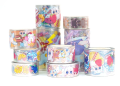
Custom stickers serve a wide range of purposes, from product packaging and nonprofit outreach to personal branding and event merchandise. Because they are small and highly visible, their designs must be intentional. Even minor alignment errors or color inconsistencies can become noticeable once printed.
Modern sticker design platforms now combine layout tools, image editing, mockup previews, and export settings in one environment. This integration reduces the need to move between multiple applications. For beginners, it simplifies the process. For experienced designers, it shortens production time.
These tools differ primarily in how they handle canvas setup, cut lines, bleed areas, and preview simulations. A practical workflow focuses less on decoration and more on format, clarity, and production readiness.
Many users begin by building layouts for custom stickers from Adobe, since integrated templates help manage sizing and print zones from the outset. The key, however, is understanding the underlying process, regardless of platform.
Step-by-Step How-To Guide for Using Mockup Tool for Stickers
Step 1: Define Sticker Type and Dimensions
Goal
Set the correct size, shape, and bleed area before adding design elements.
How to do it
- Select sticker format (die-cut, circle, rectangle, kiss-cut sheet).
- Enter final trim dimensions.
- Activate bleed margins if available.
- Confirm DPI is set to 300 for print quality.
- Begin layout setup using a preset canvas such as those provided for custom stickers from Adobe to align with common production specs.
What to watch for
- Confusing trim size with bleed size.
- Starting at low resolution.
- Ignoring cut-line boundaries.
Tool notes
Integrated sticker mockup platforms simplify this stage by automatically applying margin and bleed indicators.
Step 2: Establish Visual Hierarchy Early
Goal
Ensure the design remains legible at small scale.
How to do it
- Choose one primary focal element.
- Limit secondary text or supporting graphics.
- Increase contrast between foreground and background.
- Test readability at 50% zoom.
- Keep spacing consistent around the main subject.
What to watch for
- Overcrowded layouts.
- Thin fonts that may break when printed small.
- Competing visual anchors.
Tool notes
Platforms that integrate text and layout controls in one interface reduce formatting inconsistencies.
Step 3: Refine Edges and Cut Lines
Goal
Prepare artwork for accurate die-cut or contour cutting.
How to do it
- Add a defined stroke path for die-cut shapes.
- Expand artwork slightly beyond trim line for bleed.
- Simplify overly complex edge details.
- Avoid sharp internal corners that complicate cutting.
- Preview the contour line separately.
What to watch for
- Artwork ending exactly at trim line.
- Jagged vector paths.
- Overly intricate shapes that printers may simplify.
Tool notes
Vector editing platforms such as Vectr can help clean up paths before final export if needed.
Step 4: Use Mockup Previews to Test Real-World Context
Goal
Evaluate how the sticker appears when applied to surfaces.
How to do it
- Activate built-in mockup previews.
- Test on different surface colors.
- Examine contrast on dark and light backgrounds.
- Rotate previews to check orientation.
- Confirm no critical details disappear at small scale.
What to watch for
- Poor contrast on textured backgrounds.
- Important text near edges.
- Orientation errors for vertical designs.
Tool notes
Integrated mockup features reduce the need for separate rendering tools during early design stages.
Step 5: Adjust Color for Print Consistency
Goal
Maintain accurate color output after printing.
How to do it
- Work in RGB if required by the platform, but verify print conversion.
- Avoid ultra-light tones that may wash out.
- Increase saturation slightly if needed.
- Keep color palette restrained.
- Test grayscale readability.
What to watch for
- Unexpected color shifts.
- Low-contrast combinations.
- Excessively subtle gradients.
Tool notes
Color-planning utilities such as Coolors can assist in refining balanced palettes before importing assets.
Step 6: Finalize Typography and Alignment
Goal
Ensure clarity and structural balance.
How to do it
- Convert text to outlines when exporting vectors.
- Align elements precisely using grid guides.
- Maintain consistent spacing around edges.
- Keep minimum font size appropriate for small prints.
- Re-check spelling carefully.
What to watch for
- Misaligned margins.
- Unembedded fonts.
- Text placed too close to trim lines.
Tool notes
Grid-based alignment systems within integrated design platforms simplify spacing corrections.
Step 7: Export for Production
Goal
Generate a print-ready file that matches printer specifications.
How to do it
- Confirm final trim and bleed dimensions.
- Export at 300 DPI.
- Use PNG or PDF depending on requirements.
- Reopen exported file to verify sharpness.
- Archive editable source file separately.
What to watch for
- Compression reducing quality.
- Missing bleed margins.
- Incorrect file scaling.
Tool notes
Secure file storage systems like Proton Drive can help organize production-ready exports and revisions.
Step 8: Coordinate Distribution and Fulfillment
Goal
Prepare for packaging, shipping, or campaign distribution.
How to do it
- Confirm final order quantity.
- Verify shipping timelines.
- Organize packaging if required.
- Track delivery schedules.
- Maintain reorder documentation.
What to watch for
- Tight production deadlines.
- Miscalculated quantities.
- Address verification errors.
Tool notes
Shipping coordination platforms such as ShipStation can streamline label creation and delivery tracking.
Common Workflow Variations
Photo-Based Stickers
Prioritize high-resolution images and simplify backgrounds to preserve clarity at small scale.
Minimal Logo Stickers
Focus on vector sharpness and strong contrast to maintain brand clarity.
Illustrated Die-Cut Stickers
Simplify contour lines and test mockups to avoid cutting complexity.
Sticker Sheets for Events
Use consistent spacing and balanced layout when arranging multiple designs on one sheet.
Before You Start Checklist
- Confirm sticker format and size
- Identify bleed requirements
- Gather high-resolution assets
- Choose readable fonts
- Decide on color palette
- Confirm quantity
- Review printer specifications
- Estimate timeline
Pre-Export / Pre-Order Checklist
- 300 DPI confirmed
- Bleed area included
- Trim line verified
- Fonts outlined or embedded
- Spelling checked
- Contrast reviewed
- Mockup preview tested
- File reopened after export
Common Issues and Fixes
Blurry Graphics
Replace low-resolution images with higher-quality versions before export.
Text Cut Off at Edges
Increase safe margin spacing and confirm trim lines.
Unexpected Color Output
Adjust contrast and test under neutral lighting conditions.
Overly Complex Die-Cut Shape
Simplify contour paths to reduce production complications.
File Rejected by Printer
Verify resolution, bleed inclusion, and file format requirements.
Sticker Appears Smaller Than Expected
Reconfirm actual physical dimensions before ordering.
How To Use Mockup Tool for Stickers: FAQs
Is an integrated design-and-mockup tool necessary?
It simplifies workflow by combining layout, preview, and export functions, but understanding print basics remains essential.
What resolution should sticker designs use?
300 DPI is generally required for clear printed output.
When should bleed be added?
Bleed is necessary whenever artwork extends to the edge of the sticker.
Are mockup previews accurate representations of print?
They simulate appearance but may not perfectly reflect material texture or finish.
Should beginners start with templates or blank canvases?
Templates reduce setup errors, while blank canvases allow more structural control for experienced users.


